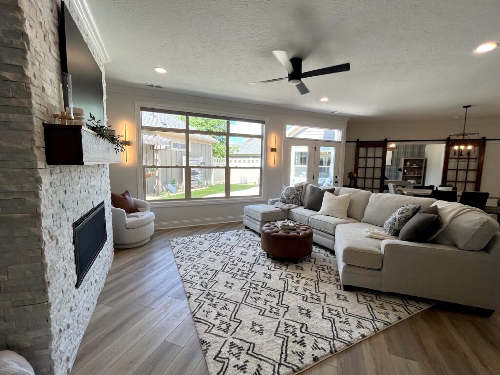
The Dunlap’s
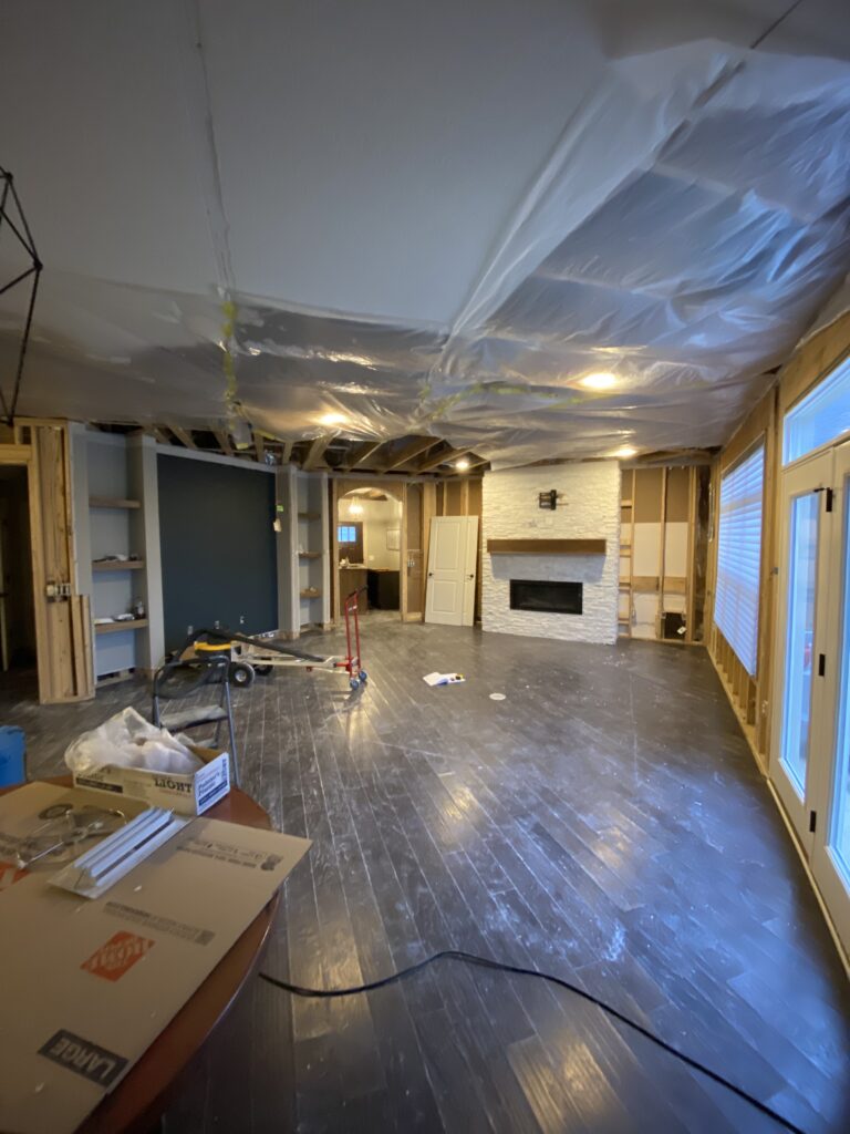
This project began with the ceiling on the floor… literally. There was a massive and very unfortunate flood that left this whole house with about a foot of water. We previously remodeled this home a few years ago, but when the Dunlap’s called, we knew we had a lot of work to get this space transformed back into the home they know and love. Although the flood was devastating, this allowed us to work with an entirely clean slate because everything from the floors to the ceiling to the drywall had to be replaced. The Dunlaps have a lovely blend of style – we would describe it as a mix of modern and farmhouse with notes of light, cozy, but not scared of drama!
First Up… Floors
Since the whole house was going to be remodeled, our first design thought was “floors.” Floors set the tone for everything being placed on top of them. There are so many different avenues you can go down when choosing your flooring. Do you want something calm and soothing? Bold and dramatic? Colorful and fun? There are so many options. Prior to the flood, this home was filled with a darker, more rustic hardwood. After living with it for many years, they decided they wanted a bit of a change and something lighter. We reached out to our local vendor at Panel Town and instantly knew we wanted to go with the Shaw Endura Plus Driftwood Luxury Vinyl Plank. This LVP is light and airy, but it also has elements of contrast within each board which creates the perfect combination. This selection of flooring certainly set the tone for how the rest of the home would feel when we went to the drawing board. It is the perfect selection for any style.
Paint & Touch Ups
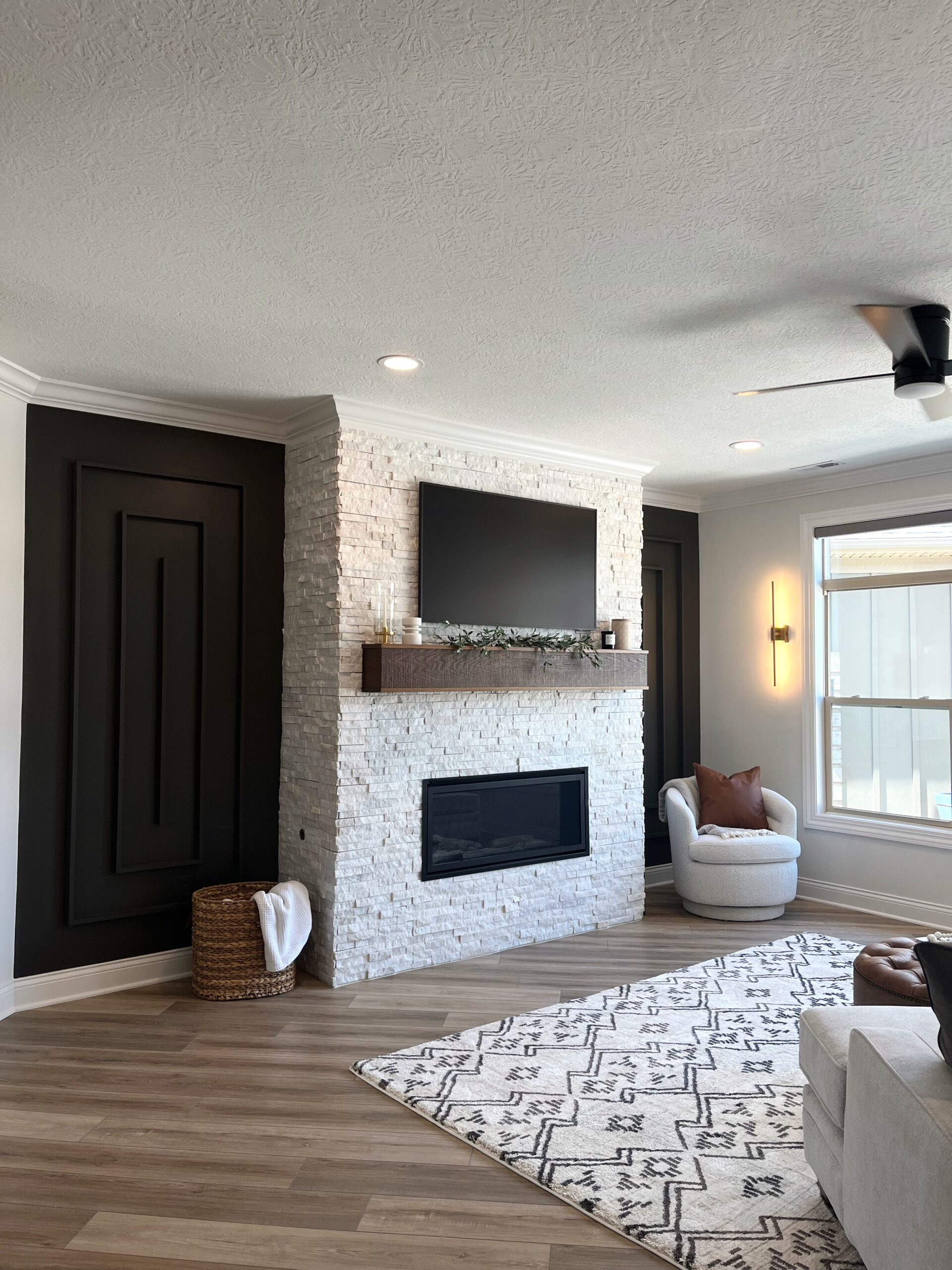
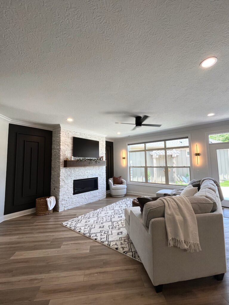
After deciding the flooring that would go throughout, the next thing to tackle on the list was the fireplace and paint. Luckily the previous stone used in their last remodel held up extremely well throughout the flood. There were a few pieces that needed to be replaced, so we were able to match the stone perfectly with this Marble Panel from Floor and Decor. On either side of the fireplace, there are two smaller walls that were perfect for an elevated accent wall. We decided to go with this simple pattern of a line within a box within a box. This added just a little bit of dimension, but it truly made all the difference and elevated the space from simple to a touch of dramatic. We enhanced the drama by painting these two walls a contrasting color from the fireplace and the other walls throughout. We wanted a darker color but felt that adding an accent wall of black would be really harsh for the space we were trying to create. We decided to go with the color Urbane Bronze 7048 from Sherwin Williams. This was the perfect color because it had darker tones but the warmth of the brown within this shade still made it feel nice and cozy.
Cheers to the Bar Area
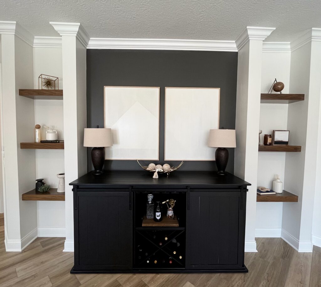
We loved this color so much, we decided to use it within the nook in the living room as well. This nook is surrounded with floating shelves on either side and was the perfect area to place a bar cart. With this in mind, we thought bringing these darker tones to the bar area would create a space that felt cohesive and intentional. We decided to only paint the back nook wall to keep the balance of boldness and lightness throughout the whole room. As for the rest of the walls in the living room, we chose Origami White 7636 from SW. This color is the perfect creamy white that feels delicate and super organic. Again, we didn’t want to choose a white that was super stark, so we opted for this off-white that makes you want to snuggle up with a blanket while you sip your morning coffee.
Lighting Sets the Mood
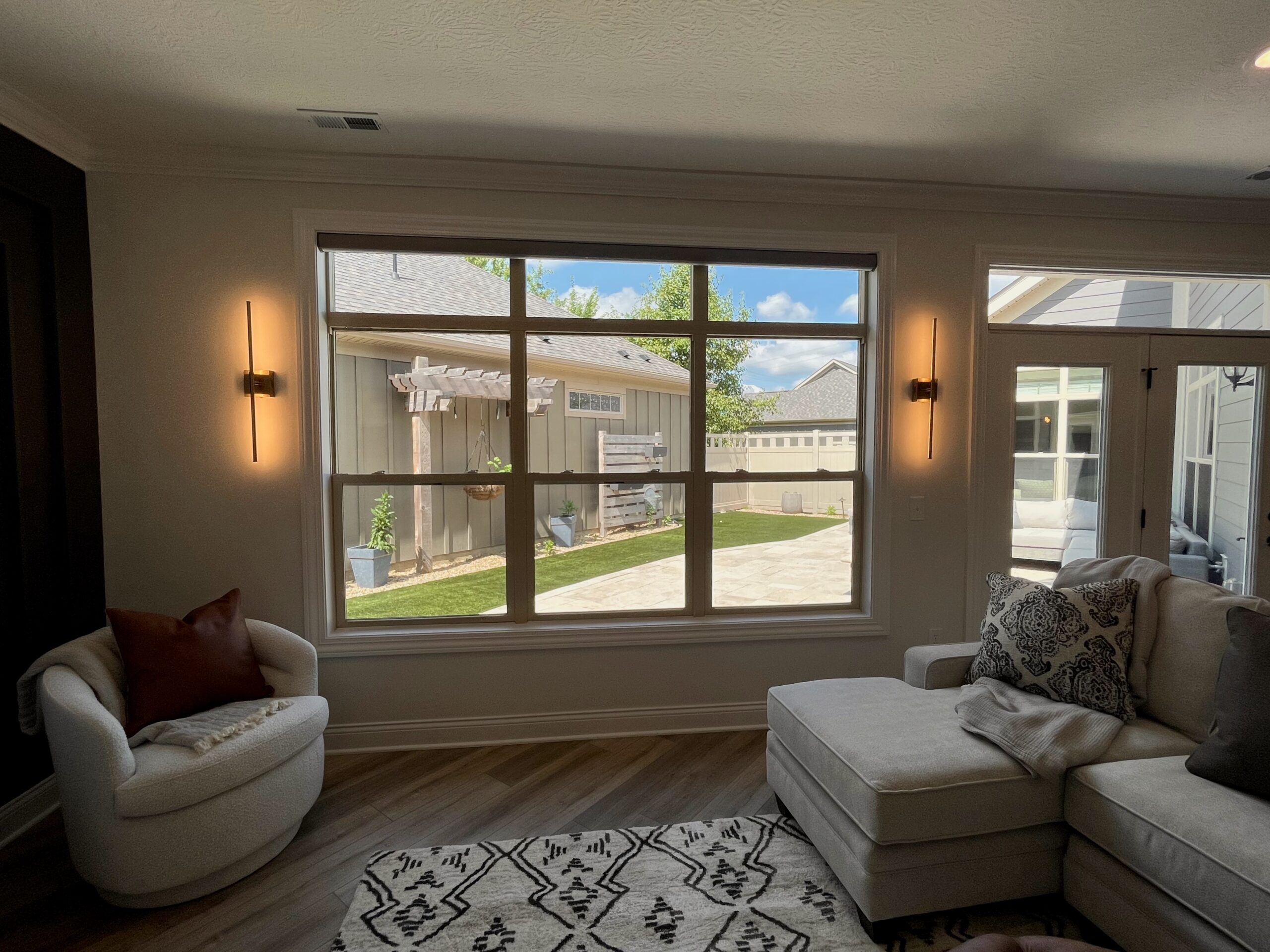
Another element we sourced out were these badass gold sconces from Wayfair. We decided to install these on either side of the huge window. Even though they get a ton of light during the day, these lights look amazing turned on during the day and especially at night. They add a dramatic element that you can only get through lighting. The last part of the construction was the overhead ceiling fan. Since they get so much light during the day and now have sconces and two overhead can lights, we opted for this fan. A super elegant and modern fan that fit perfectly into this space.
The Couch
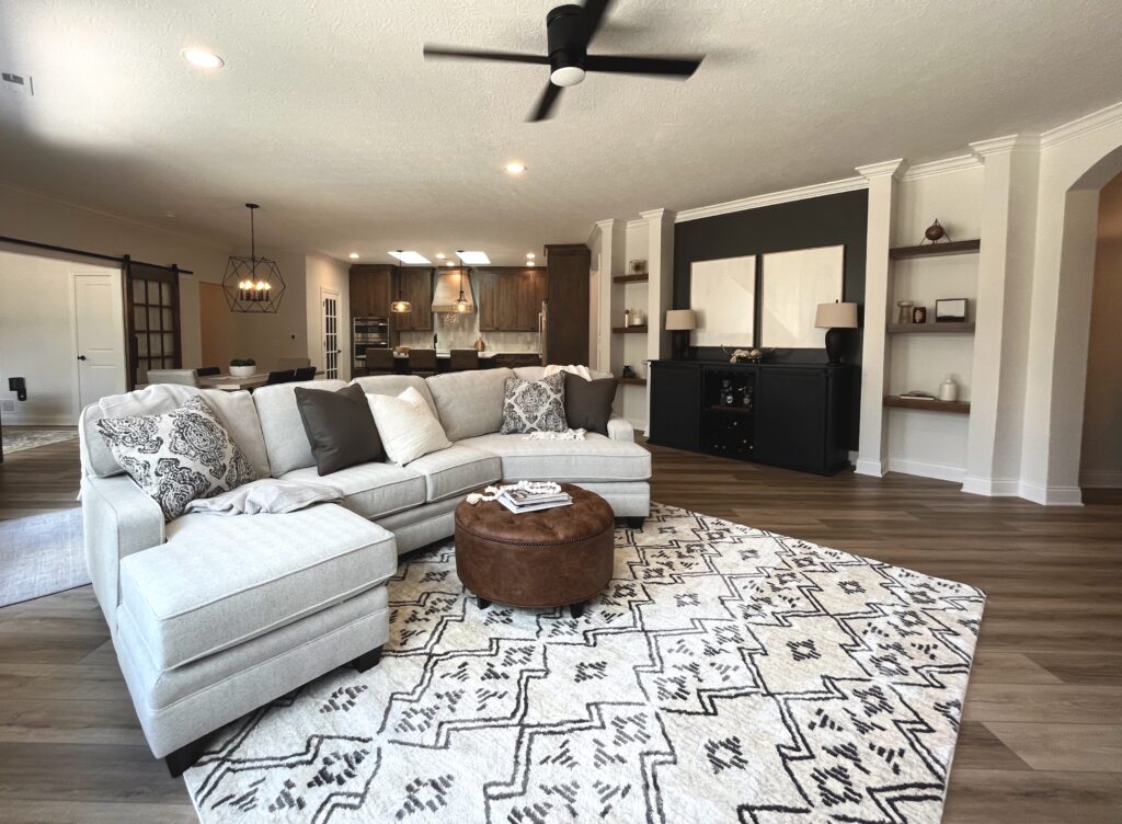
After we decided on the items that are more related to the construction element, we got to move to the fun part of furnishings! The first big task was sourcing out the couch. This is the first thing you see when you walk into their living room, so it was extremely important that we found a couch that was meant to be in their home. After many appointments, we landed on this ah-mazing couch from Vinson Fine Furniture. We chose this light gray chevron pattern for the couch fabric with two pillows to almost perfectly match the Urbane Bronze wall color and two pillows with a fun but subtle pattern. This combination was something the client had dreamed of and really fit perfectly within the space. We source everything out with the intention of it always meaning to be there – we want every piece within your home to mean something and to reflect who you are.
All The Furnishings
After finalizing the couch, we got to work wrapping up the last larger pieces of furniture within the room. The first thing we were on the lookout for was a giant rug to ground this space and make it feel cohesive. We ended up choosing this super soft and plush rug from At Home. It had a moroccan pattern which is a bit outside of our clients normal style, but we felt this bold pattern would really correlate with the accent walls and create some play and depth within the room. Since the colors of the rug are ivory and a darker gray, we knew it would coordinate and still work within the vibe we were trying to create. We also sourced out this vegan leather ottoman as the coffee table. We wanted a different texture especially in the middle of the room to elevate the overall feel. This ottoman was the perfect choice and really honed in on the farmhouse aspect of their style. To mix with the farmhouse style, we found this amazing modern boucle swivel chair from West Elm. This was the perfect addition to add in the corner of the room in front of the accent wall. The white fabric added this beautiful contrast against the darker wall, and yet another aspect of texture that makes this corner the best spot for an afternoon read or email check up. The last large piece of furniture was the bar cart. This was an item we sourced out for their last renovation, and unfortunately it got ruined during the flood. They absolutely loved the quality and customizable aspect to this bar credenza from Wine Enthusiast. We opted for the black option to touch on the modern aspect of their home while also adding a subtle pop against the darker wall.
Decor is like Jewelry
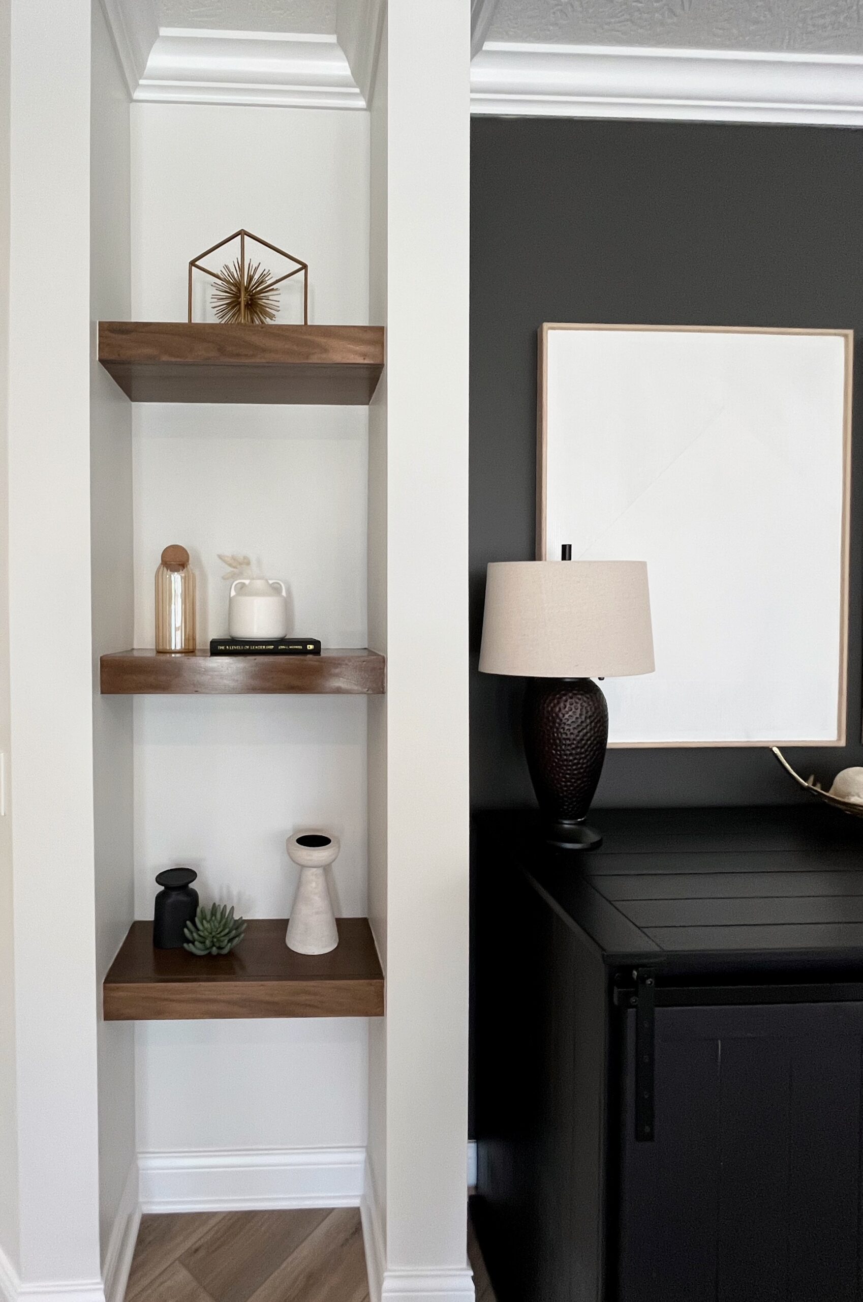
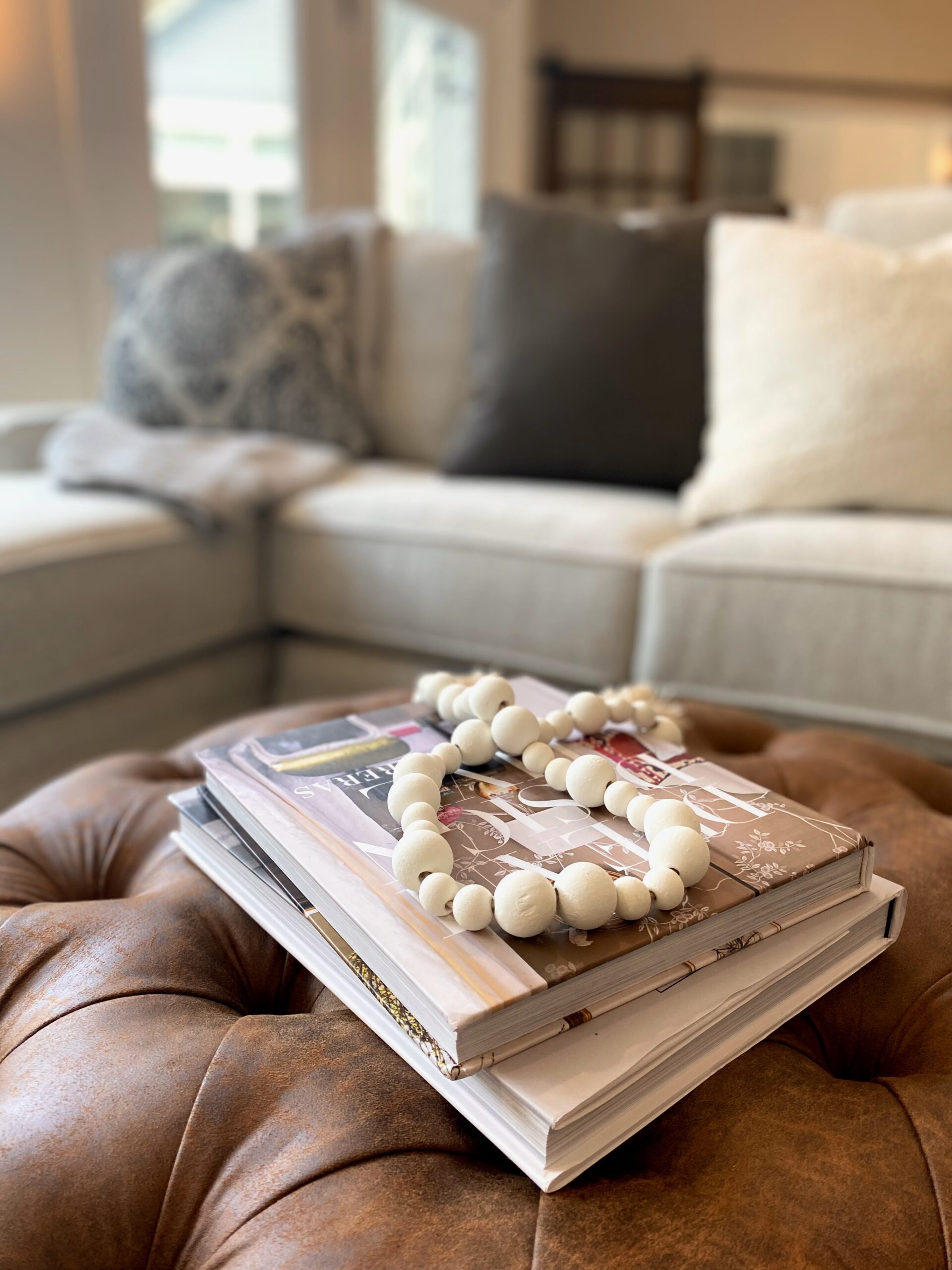
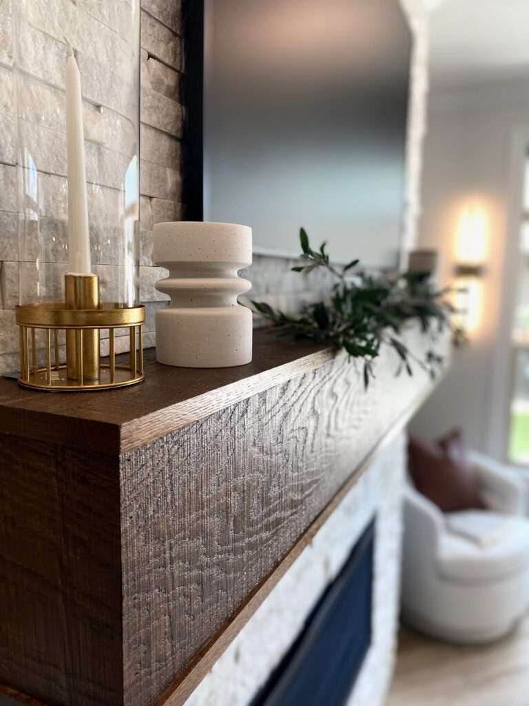
From here, we really got to hone in on all the decor and smaller pieces to bring this room to life. Accessories and decor for renovations are like the jewelry to your outfits – you really aren’t complete without them. We shopped mostly at At Home and Home Goods for all the decor within the living room. For the leather ottoman, we placed some interior books with a beaded tassel on top. For the couch and the swivel chair, we added a few cozy throws and some additional pillows to really warm up the space and make it that much more inviting. On the fireplace mantle, we wanted to keep it really clean, minimal, and cozy. We added a gold and glass candle holder, a creamy white ceramic, a long light foliage, an amber glass candle, and a taupe and white patterned vase. The variation of height and texture on the mantle really fills out the space accordingly and allows for a seamless look. Next to the fireplace, we found this gorgeous jute basket that can store all the blankets, throws, and pillows they may desire. Above the bar cart, we found these beautiful textured plaster wall art pieces from West Elm. They really elevated the space and added a lot of contrast to the darker nook. We placed two lamps as well as some bar accessories along and within the bar credenza. On both sides of the nook, we styled the shelves with some new and existing decor. We used sentimental books and larger pieces that the client already had and added in some new vases, candles, and canvases. We styled these with the intention of showcasing every item and pulling the space all together.
That’s a Wrap!
And that my friend is a wrap! After carefully selecting each and every item that went into this room, we couldn’t be happier with the end result and feel that it is a direct reflection of the Dunlap family. We are beyond thankful they chose us to transform such a devastating event into the living room of their dreams. Peek below to see a before picture of this space… what a difference!
Designed by Ashley Kubin & Abby Georges
Written by Abby Georges
Want your space to be transformed?
Fill out our questionnaire to schedule the initial phone consult!
Be the first to comment